RADdoesGames
RADdoesGames is a Partnered channel on Twitch with over 3 thousand followers and 240,000 watch hours. They distinguish themselves from other partnered channels on the platform in a few amazing ways. Not only do they have their own separate studio giving them an extreme technical edge, they’re also comprised of three lovely people while the traditional Twitch streamer acts alone. One of the key members, Dennis, even has a few Emmys under his belt!
Recently entering into brand ambassadorships with companies like Elgato, the trio was looking to redesign their website to better connect with their audiences (new & old), have a more intuitive information architecture, as well as a fresh and cohesive brand look and feel.
My Role - Lead Designer
Project Time - 1 month
Objectives
Make the site more visually appealing by improving the overall aesthetic and user experience
Design a more intuitive and concise information architecture for a more user friendly browsing experience including an easily editable schedule that RAD could maintain

Identifying Needs
RADdoesGames is no stranger to going above and beyond when it comes to their content. In fact most people would say that is what they’re most known for. Large scale events lasting over 30 consecutive days, multiple game shows featuring a large variety of other streamers on the platform, high-performing cooking competitions are just a few examples of what this group brings to the table and we wanted their website to be just as impactful.
The site was lacking cohesion and simply put - it wasn’t doing this amazing trio and justice. The direction from the client was straightforward yet broad.
‘Homepage, calendar, media kit, and contact information’
RAD also had a solid brand identity that they requested I stuck to including imagery, color palette, and most importantly - their tone.
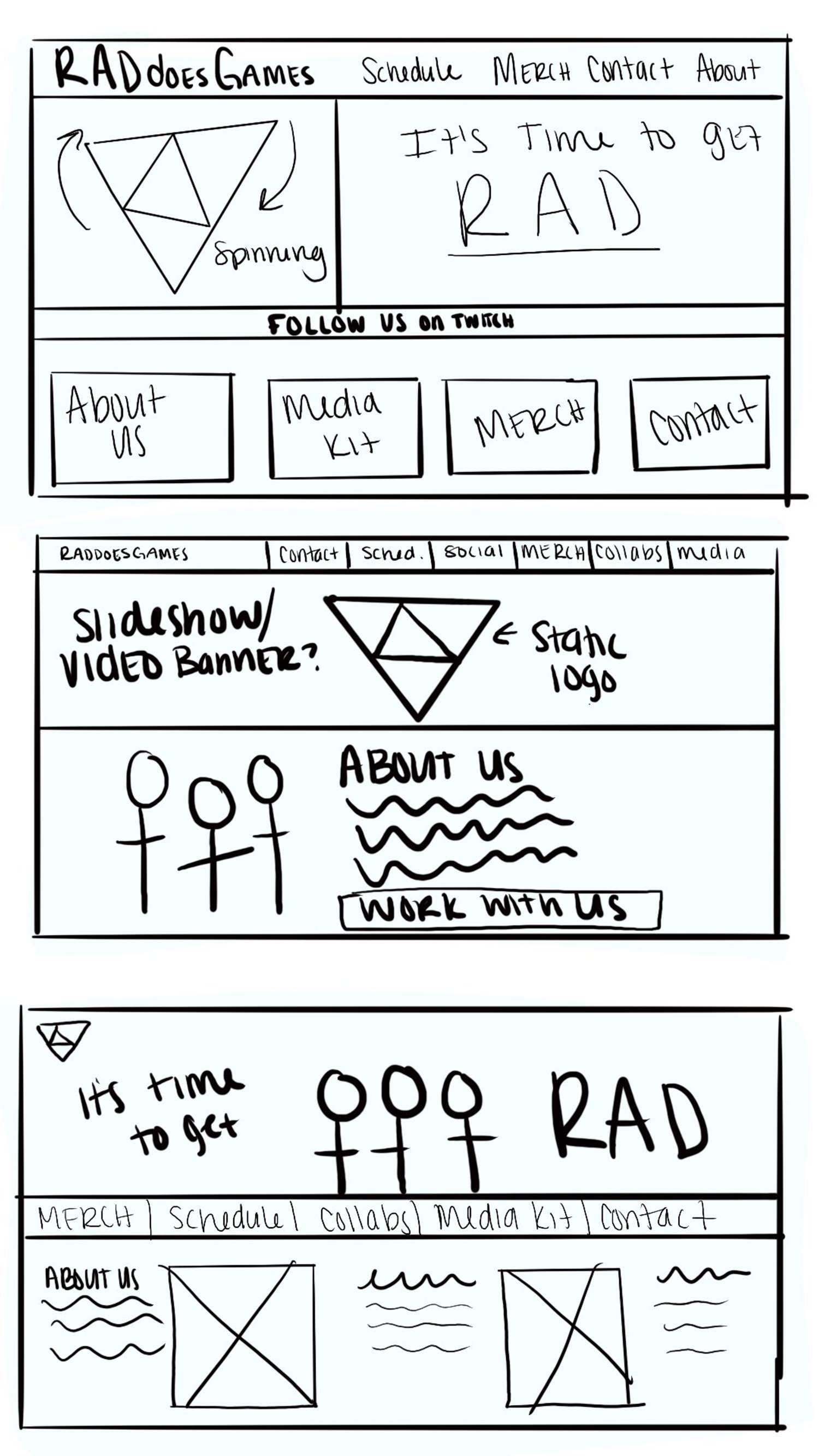
‘Paper’ Wireframes
I always like to start my projects with wireframes. It gives a much better tangible feel to how the site will truly look and feel when going into the creation stages.
Style Guidelines
RADs style was already solid and consistent throughout all of their social media platforms. They kept to the same color scheme and maintained a fun yet professional tone in their posts and their stream as a whole. Their logo - the neon tri-force - was to be adapted onto the new site, as well as some provided imagery.
While most of the physical assets were provided to me, I did customize all of them to fit the specific needs and variations needed for the site. Some logo’s were animated to spin, some images needed backgrounds removed, and so on.
The Finished Product
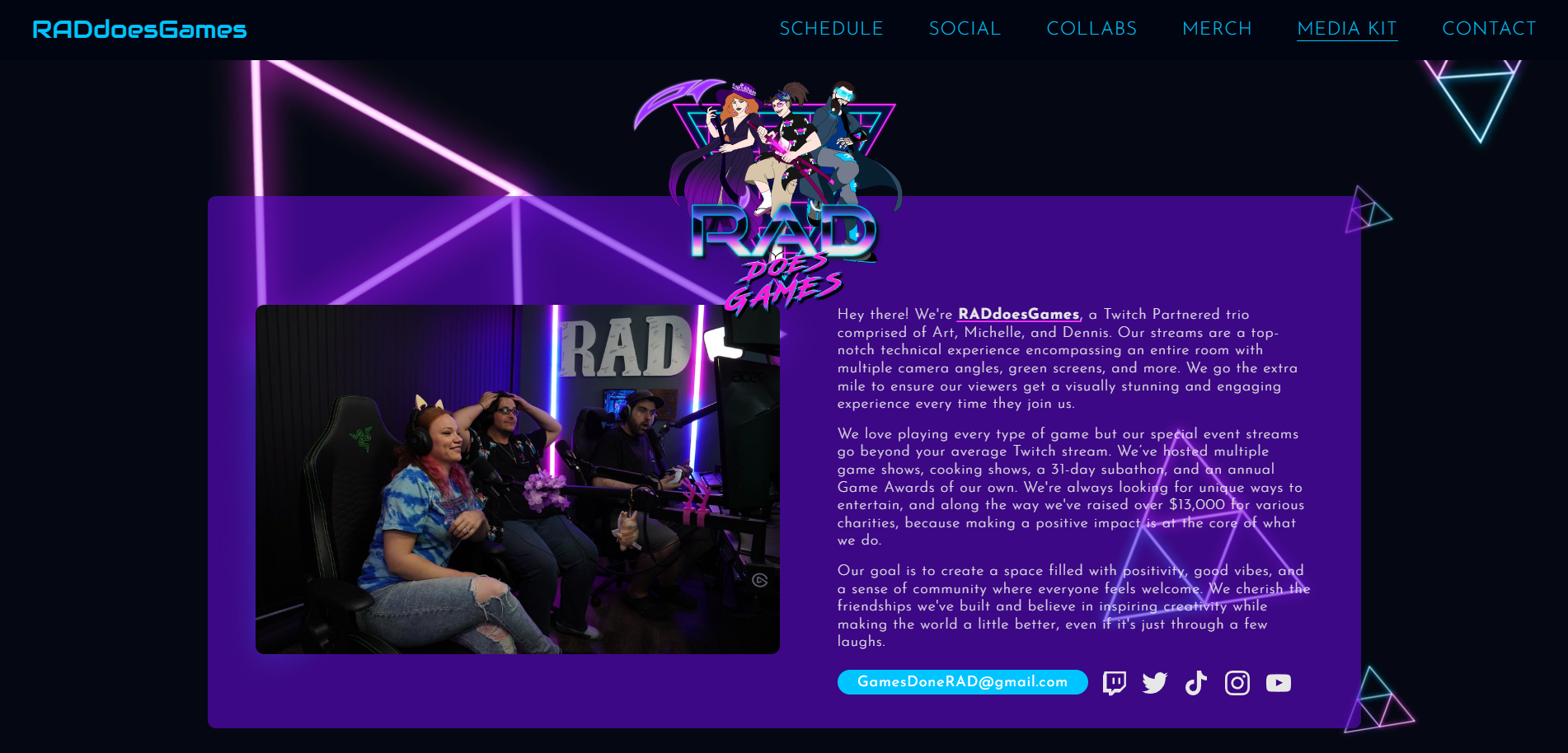
The new and improved RADdoesGames website really encompasses everything they were looking for while keeping it easily navigable for the user. The information is easily viewable and accessible for all users. By utilizing their strong branding, the site stays consistent with their socials and feels seamless when going from one to another, building trust with their community. The site now has ample room to expand and add more pages as needed.


